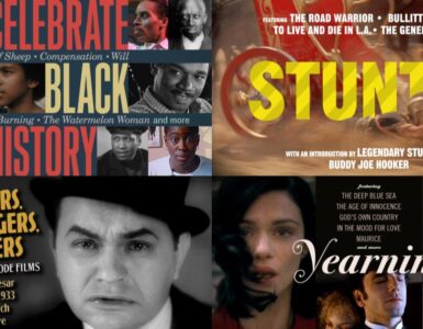

Dan Ibarra and Michael Byzewski, together known as Aesthetic Apparatus, have quickly become the most sought after and highly respected silk-screen graphic designers for the indie music scene. Although their work is usually associated with concert posters and prints, Aesthetic Apparatus has also branched out to include film posters and prints for repertory movie theaters and, more importantly for Criterion fanatics, DVD covers. The Minneapolis-based duo began designing and silk-screening together for Planet Propaganda when they were both fresh out of school. Once they realized their common interests, they started silk-screen projects for their favorite local bands.
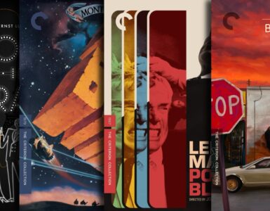
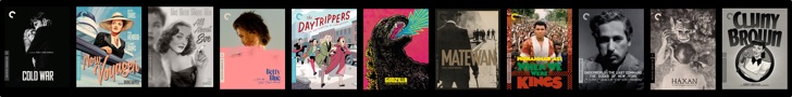
Their work proved so popular that they decided to form their own company, launching their website to promote their material in design competitions and design annuals. Their posters show a strong sense of style, using bold graphics, collage, old found art and illustrations, ephemeral imagery, and humor. Music fans recognized their unique sensibilities and began collecting their work. Even before Aesthetic Apparatus became the poster power-house that they are today, Criterion was one of the first companies to take notice of their unique style, commissioning them to design DVD covers and layouts. If you’ve never noticed their covers before, you certainly will now.
When you first met each other at Planet Propaganda, how soon after did you decide to form Aesthetic Apparatus?
Aesthetic Apparatus formed through a fairly organic process of both of us becoming friends, going to a lot of rock shows together, realizing that many of the shows we loved were not getting nearly the amount of promotion they deserved, and deciding to do something about it. The rest just kind of fell in line. Aesthetic Apparatus practically made itself in a way
In one of your previous interviews, both of you mention having received degrees in commercial art and graphic design. How important do you think having a formal art education was for you and do you think it’s advantageous for designers in general?
Formal education matters for one valuable asset, community. Otherwise, you can learn as much about graphic design as you’re comfortable learning. We both had varied design backgrounds but our best creative education came in the form of self-education and experimentation. The best education you can receive is spending all your nights and weekends doing what you love for no money and no glory. If you’re not already doing that, you’re already one step behind.

The film world is currently up-in-arms over the inevitable loss of 35mm film. Similarly, do you foresee any potential threat to the screen printing process? What would become of Aesthetic Apparatus if all the rubylith companies suddenly went belly-up?
Ironically, the ‘end of print’ for graphic design has only expanded the screenprinting culture. It seems that the ‘end of print’ meant only the end of industrial printing. So, in a sense, it’s simply one industry replacing another industry. It’s only natural. The depletion of the industry of print only expanded the craftsmanship of printing. I would assume that the depletion of the film industry would only expand the artisanship of film.
Do you always listen to the artist while producing their concert poster? Likewise, how many times will you watch a film before you feel like you can design a cover for it?
You have to do more than listen to the music or watch the film. For any creative project like a poster of a Criterion package we do as much in-depth research about the project; interviews, articles, reviews, etc.. Some films may be defined by the director’s vision, or the actors’ contribution, or the film’s cultural relevance. Every piece of film or music is important for its own specific reason, it’s up to us to figure out what that one reason is and synthesize it into a visual interpretation.

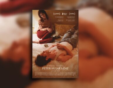
Your first assignment for Criterion was The Honeymoon Killers. Did they approach you or did you send them an unsolicited submission for another film?
When Aesthetic Apparatus first hit the ground as a full-time design studio we focused primarily on the screenprinted poster, since it is what set us apart from any other studio. We communicated our design background as well, but were (and still are) known for our print work. Criterion actually contacted us very early on in our first year as a full-time studio asking if we were capable of taking on a job with them. We nearly shit. We were intimately familiar with Criterion’s reputation and rushed at the chance to work with them. In the end, Criterion gave Aesthetic Apparatus its first crack at a non-poster design job, and we’ve been working together on and off ever since.
What sort of responsibility do you feel, designing a cover that will go into the collection? What sort of cultural weight is there, if any?
There is ENORMOUS weight on making something right for a Criterion cover. Criterion is so respected for their commitment to film, you have to design something that reflects that same commitment and respect to the discipline. We always struggle to design work that reflects this respect.

How much freedom are you given during the design process? Does Eric Skillman work closely with you?
We are given a good amount of freedom, but I feel like we have earned that freedom as well. Eric does work with us closely but I like to think that he knows that we will visually approach a film from an insightful direction. We would consider our relationship with Eric on past projects as more ‘collaborative’ than ‘directed.’
Has Criterion ever requested a specific motif from your back catalogue to incorporate in a cover? (I’m thinking of your recent cover for Island of Lost Souls and the concert poster for Explosions in the Sky)
Aesthetic Apparatus does live this double life where there is personal work that we create that has a very specific aesthetic voice. But we also work as graphic designers where our voice needs to be almost invisible in regard to the message that the project needs to convey. So, as maybe a non-answer, sometimes our personal work is cited as a good starting point for a Criterion cover (we did talk about previous AA work when we began Island of Lost Souls), and sometimes the direction is much more design-based and less dependent on our own ‘artistic’ vision.

From all the proposals that you submitted to Criterion, were there any rejected designs that you wished made the final cut?
We never show anything we’re not proud of, especially since it is a design cliché that if you show the client an option you don’t like they will inevitably pick it. But we have honestly never had any regret or wish that Criterion had picked another option when we’ve worked with them. Weird, eh?
If Criterion asked each of you to design a cover for any film you wanted, what titles would you choose?
That’s a horrible question! We stand by our statement that we never want to do a poster for our #1 favorite band. That goes for our favorite movies as well. There would be so much that we would want to say, or reflect upon that film there would be no way to make a single image suitable enough to say everything we wanted to say about the film. We would absolutely choke. How’s THAT for a non-answer!

Criterion sometimes sells posters of their cover art in their online store, but has never provided one for any AA designs, which is odd since your work is most conducive for printing. What the hell is up with that?
I DO NOT KNOW! We have tried to convince Criterion to screenprint posters of previous cover designs but it has just never happened. We need to stage a protest. Occupy Criterion until they pony up and make some nice screenprinted posters
Finally, a question to satiate my own obsessive geekery, did you guys use the same background texture (albeit inverted) for the If… and Island of Lost Souls booklets?
Hmmm, I honestly don’t know. It’s possible. We have huge archives of textures from paper, images, photographs, etc. I can’t tell you how many halftone textures we have. Probably as many as a painter does brushes. (Yes, we just made that trite an analogy.) We have more textures than we have good analogies.