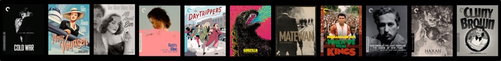

Today, Criterion announced their January 2010 DVD/Blu-Ray releases. Among them was the anticipated 2-part Steven Soderbergh epic: Che. Along with the release dates and prices, they premiered the cover art for the discs.
Was this the best they could come up with? With all of the hundreds of portraits of Ernesto “Che” Guevara, and with Criterion’s track record of beautiful cover art, I feel like this not quite up to par. I feel like it’s trying to imitate Shepard Fairey’s art style, with poor results. The single color, along with the poorly defined facial features distort the convincing transformation that Benicio Del Toro went through to become Guevara. I’m not sure exactly what I would have wanted instead.
Here is the classic portrait used by artists around the world:

Here is the Andy Warhol portrait:

Here is the art they decided on using:

(is it just me, or does the poor line work on his nose make his face look weird?)
Here are some images of the posters and cover art for the film around the world:


With this being such an anticipated release, should Criterion reconsider their choice?
Let’s hear what you think in the comments below!


Whichever looks most like a mass murderer. I say go for historical accuracy.
Whichever looks most like a mass murderer. I say go for historical accuracy.