F Ron Miller has been a staple of the Criterion design family for the past seven years and in that time has built an extensive and impressive portfolio. A stylistic chameleon, F Ron has maintained a flexible and innovative style, subtle and vibrant, perfectly matching any requirement for any project. Not only is he a reliable artist and package designer, but he has often been brought aboard other designer’s projects to give it the final touches with his unique typography. F Ron Miller was kind enough to answer some questions about his craft and his history in working with Criterion.
What/Who brought you into the Criterion design team? What was your first assignment for Criterion?
Criterion was on the lookout for designers. Art director, Sarah Habibi had mentioned this to Neil Kellerhouse who in turn passed my name along. Sarah and I spoke, hit it off, and I was invited do a package. That first assignment was masculin féminin. Criterion wanted to do a package in the style of Mademoiselle Age Tendre circa 1966 — a magazine emblematic of the Yé-yé era and female pop stars. There’s even a moment at the beginning of the film where the character Madeleine played Chantal Goya is flips through a particular issue. In reality, it’s a copy with an article featuring Chantal Goya. It’s one of those meta/looking-glass moments. The package aspires that experience — to make the implicit explicit. It was fun to do. I did a spread in the accompanying booklet in which everyone is holding a magazine or newspaper to underscore that further. Everything becomes commentary.
Could you briefly describe your educational background? How important do you think it was for you and do you think it helped you to become involved with Criterion?
I went to the California Institute of the Arts (CalArts) in Los Angeles and then The Royal College of Art in London. At CalArts I was mentored by the great Lou Danziger. That steeped me in the history of graphic design and gave me the deepest appreciation for design as a problem solving process. There isn’t an assignment I’ve been given in which I haven’t drawn on that experience in one way or another. I don’t know how much that may have helped me to become involved with Criterion. An education is mighty important but I think at the end of the day it’s all about the work and the right work ethic.
After a title is slated for release, how early in the project do you begin working on the package elements?
When I’m brought in I have about 6 to 8 weeks to do my thing; cover, menus and packaging. Occasionally less. The first couple weeks or so are mine to cogitate, work out sketches and trade e-mails. Sarah and I may bat ideas back and forth and work them out to our satisfaction before everyone else becomes involved. A concept no matter how solid it will go through further tightening, sometimes even another trip to the well. It all depends on how the artwork is corresponding to the story that Criterion wants to tell. It’s a process. Things change. It helps to stay loose and go with it.
What are the tools of your trade? Which medium do you prefer?
Aside from my ball and chain the Mac Pro and Adobe Creative Suite? I like to draw and paint but there hardly seems to be enough time for that. I’ll use a camera too. And a scanner, of course. Really, whatever gets the job done.
How much of you goes into a cover/poster? Can you give us an example of a project that you felt was completely your own?
All of me goes into a cover/poster. At least, I sincerely work to give 100% each time out. If it’s a singular style you’re looking for, I’m not so sure you’re going to see that. I’d be hard pressed to say “this piece here is 100% my style” because I don’t really work that way. I’m not cultivating a style.
Where do you find your inspiration? What films inspire you?
I’ll find my inspiration anywhere. Books, galleries, the internet. It’s the same way with films I’m all over the place, be it The Wizard of Oz, Mulholland Dr., the five hour version of Until The End Of The World, or Une femme est une femme. I find something in everything. You never know where inspiration’s going to come from. Despite the 200 channel cable package in our house it might tell you something to know my default channel is TMC.
You’ve done some amazing typography work. Do you often start from scratch when you are given an assignment or do you have an archive to choose from?
Thanks! I’ve got a pretty terrific library of books and typefaces. I’ll go to them first though lately I find myself interested more in creating my own type when time and the project permits. When it’s a Criterion job I’ll consider the film’s release date and if it’s a period picture, what period it’s representing. Mercifully that eliminates a great deal of type possibilities as I prefer to focus on era appropriate type.
Recently, you’ve provided some insightful process posts on your blog about menu layouts. Do you have much say in how the menus will be animated? Do you have specific ideas in mind when submitting layouts, or do you leave it up to (menu animator) Ian Whelan?
Ian Whelan does beautiful work and I really love his choices. Occasionally, when I have a specific idea I’ll pass it along though to Shayne Christiansen, Criterion’s videographics manager. As example, for the DVD menus of Vivre sa vie, I really felt that the shot of Anna Karina leaning against the wall soliciting made for a terrific main menu image. It’s a long continuous shot and it seemed perfect for an animated menu. Criterion happened to agree. That said, my idea didn’t include the alternating musical cues which Criterion chose –and those just put the idea over the top!
Prior to collaborating with Criterion, had you done any film related projects before?
My friend James Mangold has asked me from time to time to work on the titles of his films starting with Heavy. Jim and I go all the way back to CalArts.
What sort of responsibility do you feel, designing a cover that will go into the collection? What sort of cultural weight is there, if any?
It’s a big responsibility and it’s an honor to be participating in the cultural conversation. Though I try not to dwell on that too much, otherwise I might never find the nerve to get designing in the morning.
How much of your work is dictated by Eric Skillman/Sarah Habibi? Does the art department allow you to submit your own material, in addition to what was assigned?
There are times when Criterion has a specific idea of where they want –even need– something to land. In those instances I take it as my mission to get it as close to that mark as possible and interpret that concept as best I can. Even then, the door is always open to submit anything that feels right. ‘Cause you never know. A persuasive design can change things. There are times as well when it’s been completely open for me to pitch a concept. It really depends on the project.
What kind of restrictions do you most often deal with in the design process? (Name placement, image requirements, etc)
Hoo boy. Thankfully it’s not very often but there have been times, for legal reasons related to particular films, when someone’s name must be present at a particular size, placement and color, in relation to the the film’s title which then requires the director’s name at a particular size in relation to that someone, the film title AND the billing block on the back of the package! Have you ever worked a Rubik’s cube?
Has Criterion ever requested a specific motif from your back catalogue to incorporate in a cover?
Nope, every assignment has been on it’s own terms.
From all the proposals that you submitted to Criterion, were there any rejected designs that you wished made the final cut? Likewise, were there any designs that you were least satisfied with, and why?
Perhaps at the time I was attached a little more to one design over another but that was ego getting in the way. Whenever I go back and look at pieces with the benefit of time I’m glad that the one which was selected had been selected. It was invariably the right choice.
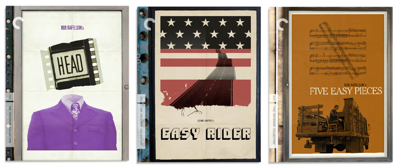
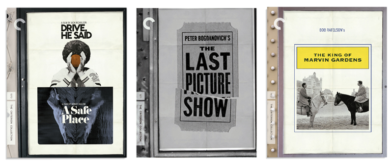
Over the years, you seem to be Criterion’s go-to guy for massive box sets, each completely different in style and layout. Your package art for The BBS Story was outstanding. Do you often try to come up with original imagery for a project or do you begin with established concepts that are already associated with the film?
With the BBS covers it was a little bit of both. I wanted to show all of these films in ways they hadn’t been seen before yet at the same time present the concepts in a way that seemed familiar. Almost all of them employ concepts associated with the film –not necessarily concepts associated with previous iterations of posters.
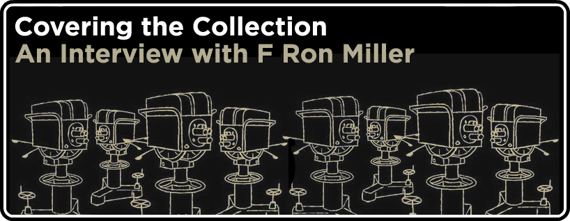
Could you tell us a bit more about your process for The Golden Age of Television? The hand-drawn illustrations and overall package design perfectly matched the material. Did you make an alternative design?
There was a TON of alternates for The Golden Age of Television. They just kept coming! I was really turned on by the material. All variations on a theme. I’m a big fan of the work of William Golden who was the art director at CBS in the 1950s and early 60s. Here was material perfectly in synch with that aesthetic. I pitched a bunch of ideas along those lines and Criterion was happily on board. One of Golden’s go-to illustrators was Ben Shahn and I attempted to render all those TV studio illustrations in that style. I’m no Ben Shawn but I think they turned out well. I used a brush, though I found out later from someone who knew him that Shawn drew a lot of his stuff with a frayed match stick. Gonna have to try that sometime.
If Criterion asked you to design a cover for any film you wanted, what titles would you choose?
You know, occasionally a title will spring to mind –something which I imagine to be a likely candidate for the collection but I’ll never speak it directly. Be careful what you wish for and all that! Though, for you Robert I will say that I’ve dropped one of those titles already in this interview…
Are there any super-secret projects for Criterion that you’re currently working on? If so, can you give us any cryptic clues?
I treat them all as super-secrets and remain mum until announcement day because I’m as discreet as I am superstitious!
Have you even been inside the Criterion Closet? How many DVDs do you think you could carry while running at full speed?
I haven’t tho I’ve studied enough of the videos to know that all those famous directors know little of the smash and grab –but then, a camera is running!
Does the existence of fake criterion covers influence how you design a cover, do you look to see if someone else has already made a cover for the film you’re working on, and does that shape your own design? (However thinly veiled, this one is actually a personal question since the majority of my blog is dedicated to fake criterion covers)
Ha! I love the fake covers I think they’re awesome. I’m as influenced by them as I am by anything, really. I don’t do any research until a few days after seeing the film so as not to contaminate the process. I want to see a few of my ideas on a subject before venturing out and seeing someone else’s. After that, it’s all fair game!
I’d like to thank Mr. Miller again for taking the time to answer my questions. For anyone who enjoyed his comments and would like to read more about his process, please visit F Ron Miller’s blog,


