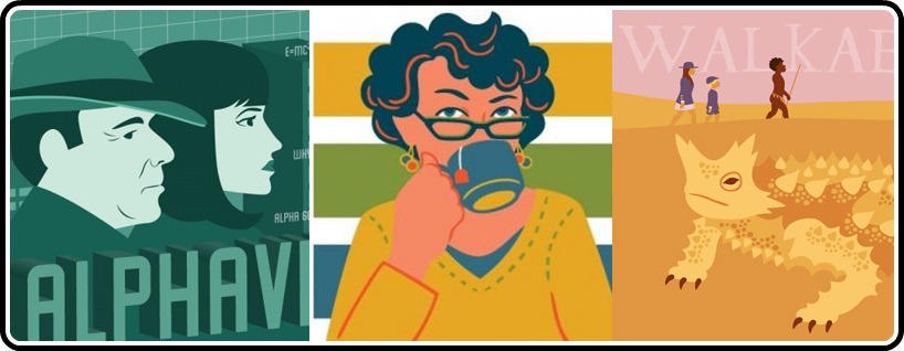
Though real-life experience doesn’t always work out so convincingly, sometimes a cliche like “one good thing leads to another” actually does ring true. At least that was the case back on February 1 of this year, when I was catching up on one of my favorite blogs, Matthew Dessem’s The Criterion Contraption. One of the comments there caught my attention and led me to follow a link that landed me on one of the most unique and creative Criterion-related blogs I’ve found.
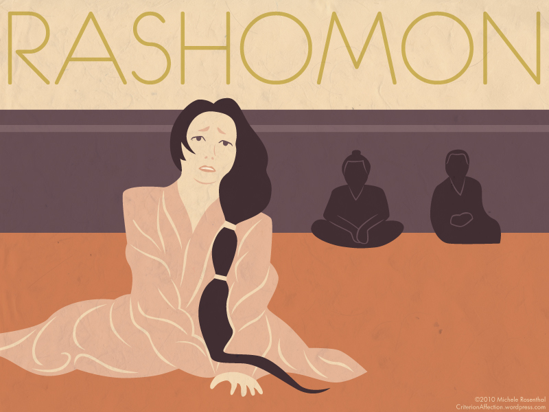
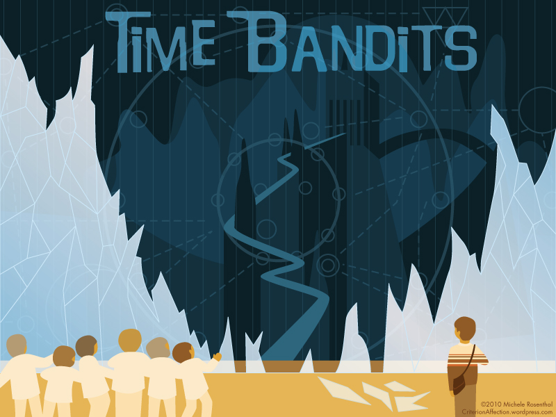
Criterion Affection offers a more visual than prosaic take on the various entries in the Criterion Collection, and I was quickly drawn in by the colorful renderings that artist Michele Rosenthal created for each film. Sensing a kindred spirit in her ambition to watch every Criterion release and leave behind some souvenir of the encounter (hers in pictures, mine in words), I just had to know a little more about this person than what she divulges on her website. So we conducted an email interview a few days ago and here’s what Michele had to say.
David: What’s your background as a film fan? How long have you been watching Criterion films and what drew you to the Collection to begin with?
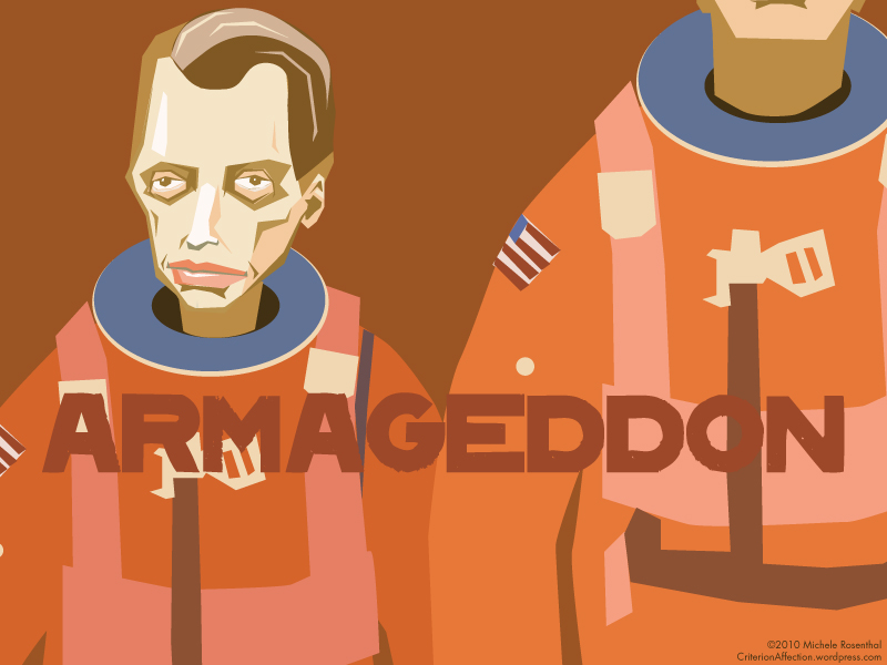
Michele: I guess you could say I’ve been watching Criterion films since seeing Armageddon at age fourteen. But my “official” film appreciation started in college, thanks to an excellent student-run rare film club. I later ran the group myself, but only so I could keep it going for another year. (I’m afraid I wasn’t a very good president.) What drew me to particular Criterion films, and eventually the entire collection, has always been their beautiful DVD packaging. I’m a designer, so I judge everything by its cover. I remember as a teenager renting The Discreet Charm Of The Bourgeoisie from the library, knowing nothing about the film or Buñuel, simply because I was so intrigued by the image of giant lips in a bowler hat.
When I started my own Criterion-related blog, I was influenced by other online writers who impressed me with their insight about the great films that I was discovering on the Criterion label. Were there any particular sources who inspired you to create your own visual impressions of the movies?
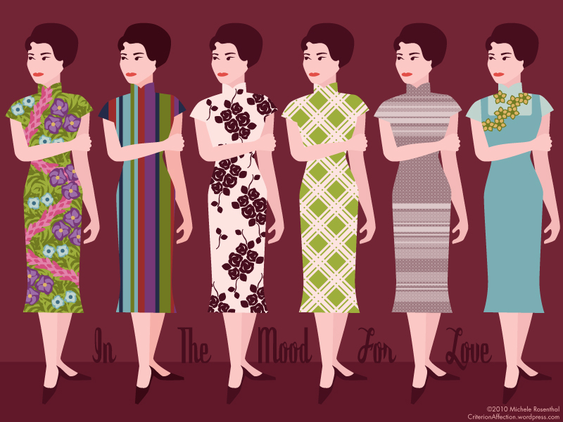
I’m inspired by too many illustrators and artists to count. One in particular, Israel Sanchez, has done some wonderful interpretations of his favorite titles. But really, the idea was a natural combination of things I love. Before the blog, I had already illustrated a few films that I wanted to pay homage to, like The Breakfast Club. I was inspired again after seeing the gorgeous parade of dresses from In The Mood For Love, and a friend suggested I turn it into an ongoing project.
Your blog mentions that you intend to eventually watch all of the Criterion flims. Do you also intend to do an illustration for each one or is that detail still negotiable? Are there any Criterion titles that you’ve decided not to illustrate, and if so, for what reason?
There’s no way I plan to do over 500 illustrations! I think watching them all will be challenging enough, and the illustrations are really a supplement to that. In fact, my goal to watch the entire collection long predates the blog.
There are definitely a few films I’ve intentionally skipped over. I’ve yet to attempt a Wes Anderson film, because his brother has already given them such a lovely, distinct illustration style, and I feel no need to improve on it. I also decided against Rome, Open City because I didn’t think my style fit the realism that’s so important to the film.
How do you choose what film to illustrate next? Any patterns or structured plans, or is it more of a random spontaneous thing? Does a film have to move you in some particular way to “earn” a spot on your blog?
There is no rhyme or reason to it whatsoever. I watch whatever strikes my fancy at the moment, and I usually illustrate the most recent film I’ve seen. If I’m indifferent to a movie I won’t blog about it, but most new titles that I watch make the cut.
What’s your process for creating an image and blog post? Do they come together quickly or do you have to work on them for awhile until you get it just right?
The illustration can take forever. I’m always happier when I take the time to get it right, and then wait a day to make sure I still like it. Obviously, some images come together faster than others. The written portion is the last step, and I try not to spend too much time on it since film analysis is not at all my area of expertise, and I don’t think it’s really what the blog is about.
Do you have any particular favorites of the illustrations you’ve created for Criterion Affection? Any that you’d like to go back and do over, or illustrate some other scene from the movie? Any that you would humbly propose to Criterion as improvements over the current DVD covers? Would you be up to the challenge of designing the packaging for a future Criterion release? :)
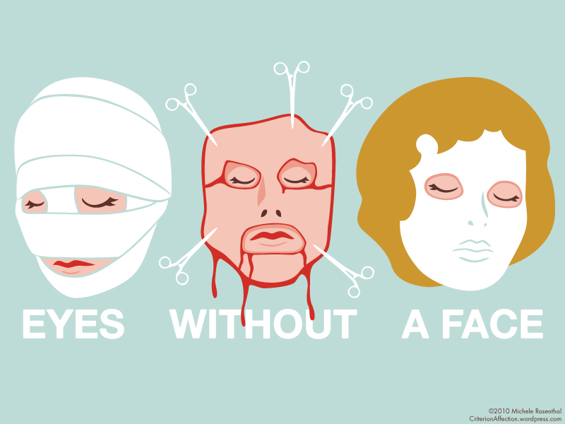
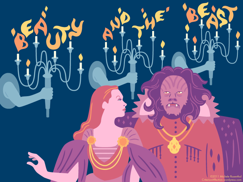
I’m very happy with the illustration for Eyes Without A Face, although the visuals in that film are so striking it made my job pretty easy. I also like how Beauty And The Beast came out’”that’s one where I put a lot of work into the details, and hopefully it shows. Usually my favorite illustrations are also the most recent. They start to lose their charm if I stare at them for too long. I wouldn’t mind editing (or deleting) a lot of my previous work, but I try not to look back.
I wouldn’t think of replacing any of the Criterion covers. One of the reasons I work with a horizontal format is so that they’re not mistaken for DVDs. Now, if Criterion ever approached me to work on a new release, I would think about it for a little bit, casually accept, then cross it off of my “all-time dreams come true” list.
You’ve been working on Criterion Affection for about 15 months now. A lot of hobby blogs don’t make it even that long. Are you still going strong?
I’m still plugging away! Ideally I like to post twice a month. It helps that it’s something I enjoy, and it’s always nice to have a project waiting whenever I have free time and I’m fishing around for something to draw.
Any interest in illustrating titles from Criterion’s Eclipse line or some of the recently released streaming-only titles they’re now including on their Hulu Plus channel?
I’m interested in watching them, but I probably won’t do any drawing. 500 plus titles is enough to keep me busy for now.
Tell us about your other work! Besides your personal websites, where else can we see your art? What got you started as an artist, did you take formal studies or learn mostly on your own?
Well, I said I wanted to be an illustrator when I was in second grade, so I guess that says something about my single-mindedness! I went to school for illustration, and I’m grateful that I still get to do what’s on my degree. I also do a lot of freelance graphic design. My website houses most of my work, as well as links to all of those social networking places where I can be found. If anyone is in the Brooklyn area, I’ll be selling original prints at the Renegade Craft Fair in June.



1 comment