Here we are again. For the second month in a row, Criterion has apparently gone forward with releases that it does not have final product art ready for. Last month when the September 2010 titles were announced, a notable hole in their artwork was there for the much anticipated, much talked about DVD and Blu-ray release for Terrence Malick’s The Thin Red Line.
Criterion sent out a press release for the Thin Red Line, including artwork that appeared to be finalized, but as we all know, they ended up going in a much different direction.
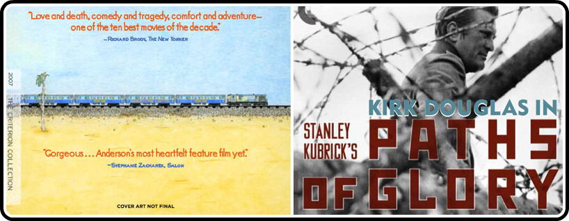
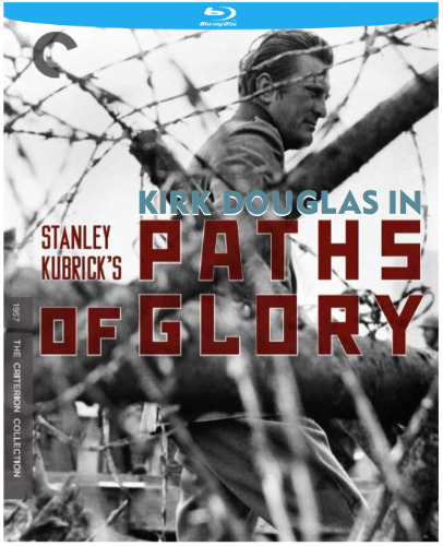
Yesterday, when the October titles were announced, we had two missing pieces of artwork for Stanley Kubrick’s Paths of Glory, and Wes Anderson’s The Darjeeling Limited. Hopefully we won’t have to wait several weeks for the final art for both, but for now I thought I’d share with you, what Criterion shared with me.
As you can see below, they clearly note that the Darjeeling Limited artwork is not final, but they don’t make the same note on the Paths of Glory cover. I think it’s safe to assume that Eric Anderson will be illustrating the cover, as he has with the past Wes Anderson Criterion titles (Rushmore, The Royal Tenenbaums, and The Life Aquatic).
As was the case last month, Criterion used the blue stripe along the top of it’s mock ups, indicating that they are Blu-ray releases, but DON’T THINK THAT CRITERION WILL USE THESE BLUE STRIPES IN THE FINAL ART. I don’t think we need our comments to devolve into another discussion about that issue.
What do you think of these preliminary pieces of cover art? If these aren’t the final images, which artists would you like to see take on these projects?


Like the PoG artwork a lot. The Darjeeling Limited artwork is actually a cool idea minus the critics quotes.
OK I won't get into the Blu-ray logo issue again but I really hope that Criterion has the sense to not include reviewer quotes on the cover. That looks more like a trade publication ad than a DVD/Blu-ray cover. But the art itself is nice, it fits the film and the style of the other Wes Anderson releases. Maybe Criterion will release the film in a slip cover that allows them to do the conventional Hollywood-style packaging for maximum retail impact, with the quality graphics underneath, like they did with Tenenbaums and Life Aquatic.
As for Paths, I haven't seen the movie so I can't say whether there's a better signature image but it looks fine to me. I'm not such a fan of the star credit (Kirk Douglas in…) and that blocky font is kind of ehh… (the S looks almost swastika-like) but I'm OK with it.
I'm not a big fan of the Paths of Glory artwork. I'd rather see something incorporating the more iconic shots of Dax walking through the tunnels (the first of Kubrick's many “tunnel tracking shots” which he used in his later films. Or, if they wanted to go for something less expected, they could do one of the many beautifully composed shots of the trial in the mansion. This is just Dax and some barbwire… boring.
I agree that the critics notes should be removed from Darjeeling Limited – otherwise I like it. It evokes the feel of the Bottle Rocket artwork.
The Paths of Glory cover needs to be tossed out completely… just a terrible design from top to bottom.
Yeah I love the Darjeeling art… just without the quotes, of course. The Paths of Glory is decent, but I'm not sure about the font and I really don't like the idea of the Kirk Douglas's credit on the cover, but the visual itself looks intriguing.