[Update! I forgot to include the Darjeeling Limited art from the collage, so look for an updated image later tonight. – Ryan 11:00am 9/22]
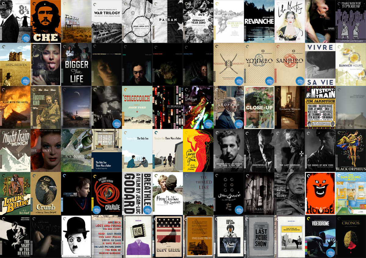
[Update 2: See the new art below, with the Darjeeling art – Ryan 8:15pm 9/22]
[Update 3: I’m going to be making another version, with L’enfance Nue, as well as the two individual Che covers, which Criterion did not make available on their site, but luckily Eric Skillman did. – Ryan 7:00am 9/23]
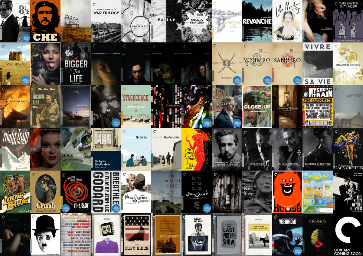
Now that we have the December 2010 Criterion Collection titles announced, I thought it’d be fun to create a collage of all of the covers from the past year.
It’s been an incredible year of DVD and Blu-ray releases, along with over 70 gorgeous covers (and spine numbers) that Criterion has produced. I set up a few basic rules for creating this collage:
- They’re essentially in order of release, from January 2010 in the upper left, to December in the bottom right. I wasn’t strict with the release dates, so it’s not a perfect order.
- I’m including the individual box art for each release, even if they were the discs within the box set.
- I’m not including duplicate covers, just because they were released on DVD and Blu-ray. If the title was only released on Blu-ray, then you’ll see the sticker.
- I’m leaving out the Eclipse titles for now, but I’ll probably make another collage, with all of the Eclipse covers for 2010.
Below you’ll see a smaller version, not watermarked, and if you click on it, you’ll get to a full size image, with our watermark on it. If you want a watermark-free version, just shoot me an e-mail, and I’ll get it to you. (I’m watermarking it just due to the work put into it, so people know where it came from). If you decide to repost this somewhere else, we’d love a link giving us credit.

Here is the updated image, including the Darjeeling Limited cover art that I forgot (to make the rectangle complete, I had to use the infamous “Cover Art Coming Soon” graphic that Criterion uses for some of their titles. I thought it was appropriate given that there were a few late covers this year):

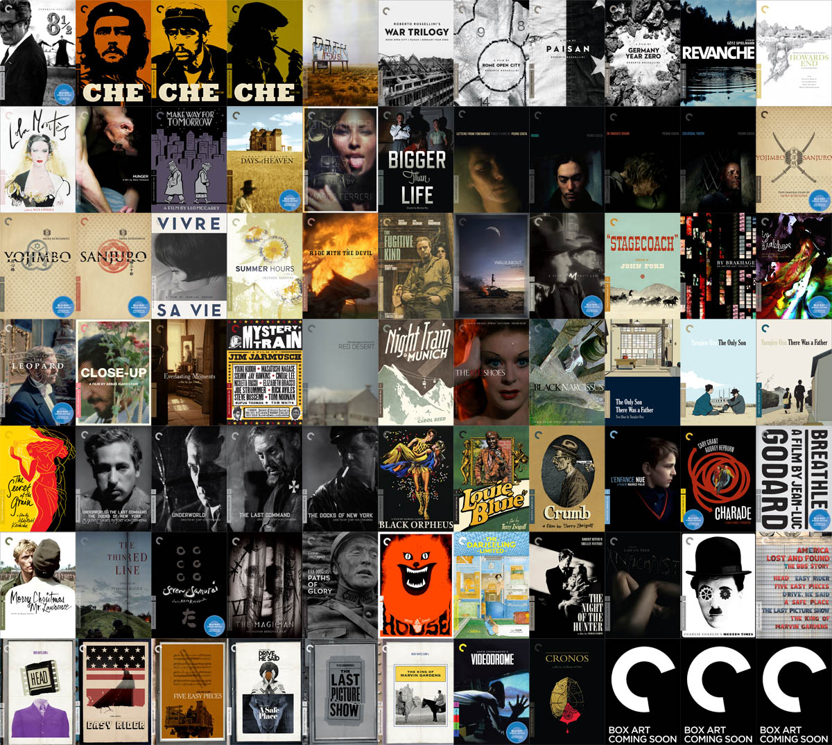
Okay, here are Take 4, and Take 5 (see comments below for an explanation as to why the two takes):
Take 4
Take 5
As we get closer to December, and we’ll have actually been able to see everything that was released, we’ll be making some “top ten” lists of our favorites.
What were your favorite titles of 2010? What are your predictions for 2011?
The 2010 Criterion Collection New Release Announcements (watch our formatting grow, month by month)


Jiminy, that image really brings into focus just how utterly gorgeous most of the covers are that Criterion is putting out these days. I tend to not really see the cover art on the releases that I don’t purchase, and I want to go back and buy some of these based solely on their beauty. Wonderful.
Very nice work
Ryan, it looks like a Take 4 will be needed – I don’t see L’enfance nue in that group! It does look great though – I like the taller rectangle, makes for better desktop wallpaper.
D’oh! I can’t believe I forgot that cover! Oh well, at least I have an open spot for it. Take 4, here we go!
Okay, so I’m now making a version 4 and 5!
4 will include L’enfance nue, and will be a perfect rectangle.
5 will include the two alternate Che cover art designs, which are not available on Criterion.com, but were available on Eric Skillman’s blog. So they’re non-canonical in that Criterion didn’t make them available online, but canonical in that they’re physically part of the collection.
The only part about take 5 that I don’t like is that I can’t get it a perfect rectangle, so I had to include 3 of the black, “cover coming soon” covers.
Unless there is a graphic designer out there that can figure out a grid pattern, that will allow them all to fit, in a aesthetically pleasing manner.