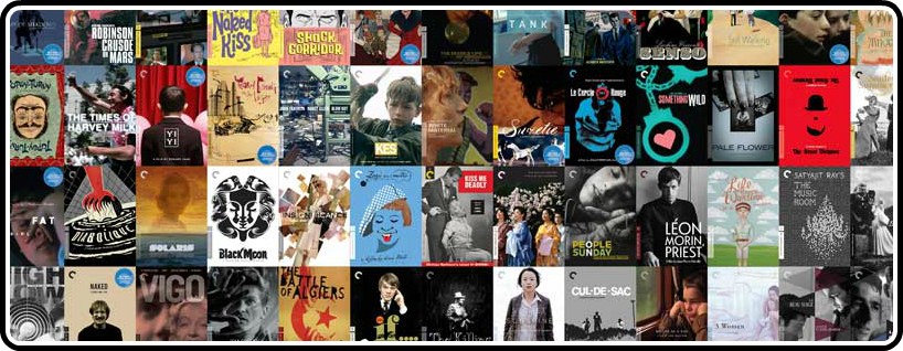
When I still lived in America (and whenever I had money to burn), I would often go to the closest DVD retailer and stare at the Criterion covers for hours at a time. Narrowing my selections to two or three, the deciding factor was the cover art. I’ve always been a sucker for packaging, and Criterion knows just how important packaging can be for the discerning cinephile.
So when writing a top ten list of the best covers to come out of the Criterion Collection this year, it was difficult to separate the designer from the design, so naturally this list became more focused on the creator(s). That being said, none of the covers would look nearly as good as they do without the direction of Eric Skillman and Sarah Habibi, both of whom have established themselves not only as amazing in-house art directors, but amazing designers in their own right. But sometimes the film requires an outside perspective from a particular designer whose sensibilities match the feel of the film. They never fail to surprise and delight me.
10. Blow Out
Credits – Art Directors: Sarah Habibi, Eric Skillman / Designer: Eric Skillman
The cover for Brian de Palma’s Blow Out perfectly exemplifies why Eric Skillman has been the art director for nearly a decade. I always gravitate towards covers that represent what the film is about, not whoever the hell stars in it. At first glance John Travolta is barely noticeable among the mess of audiotape and equipment.
The same holds true for Skillman’s cover for James L. Brooks’ Broadcast News, with William Hurt’s character obscured and cropped, leaving the reflection of Holly Hunter in the corner of the monitor. Blow Out may not have been my favorite Brian de Palma film, but seeing how much care went into this project made me give it another look. It was awesome.
9. Kuroneko
Credits – Art Director: Sarah Habibi / Cover Design: Eric Skillman, Sam Smith
From his amazing rendition of Nobuhiko Obayashi’s House, to the re-release of Tarkovsky’s science-fiction masterpiece Solaris, Sam Smith has quickly become my favorite Criterion cover artist over the past year. Smith has certainly shown his artistic sensibilities (in addition to being a kick-ass drummer for Ben Folds) with Kaneto Shindo’s Kuroneko.
Using metallic ink and lenticular printing, the central figure of the mother’s ghost appears to hover separately from the background, and then disappears when you look at it from a different angle. It also features some very nice custom lettering. Smith is very forthcoming about the process of each cover at his blog, Sam’s Myth, which I urge all of you who are interested to check out.
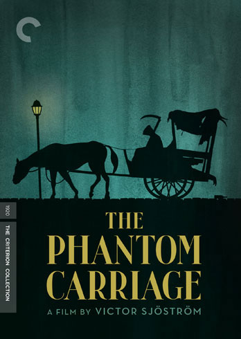
8. The Phantom Carriage
Credits – Art Directors: Sarah Habibi, Eric Skillman / Designer: Christopher King
Christopher King’s re-working of the original poster art for Victor Sjöström’s The Phantom Carriage really brought a new life to the cover. I knew nothing about the film before I bought it blindly, and King’s illustrations and color scheme aren’t something that one might associate with an old silent film, so I was pleasantly surprised with how the overall layout complimented the film.
7. The Music Room
Credits – Art Directors: Sarah Habibi / Designer: Marian Bantjes
When Criterion announced their first Satyajit Ray title they also brought aboard a new contributor whose sensibilities perfectly matched The Music Room. Marian Bantjes may be one of the best vector artists working today, and her delicately intricate patterns really stand out from all the covers this year.
The same metallic ink process as Kuroneko was used to really make the chandelier shine. Hopefully Criterion will continue using Bantjes’ designs for future Satyajit Ray releases.
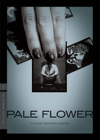
6. Pale Flower
Credits – Art Directors: Sarah Habibi / Designer: Michael Boland
Michael Boland of the Boland Design Company is probably the most frequent outside contributor to the collection. Think of any awesome cover in the collection, and the Boland Design Company is most likely responsible for it. Vampyr, Army of Shadows, Sansho the Bailiff, Burmese Harp, Contempt, Ugetsu, Le Samourai, and this year’s Pale Flower.
Honestly, I would have been happy with just a screen-grab of Mariko Kaga, but Michael Boland does such an amazing job. Having (what most likely is) Mariko’s hands covering Ryô Ikebe’s face on a hanafuda card was a really nice touch.
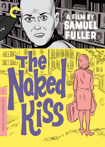
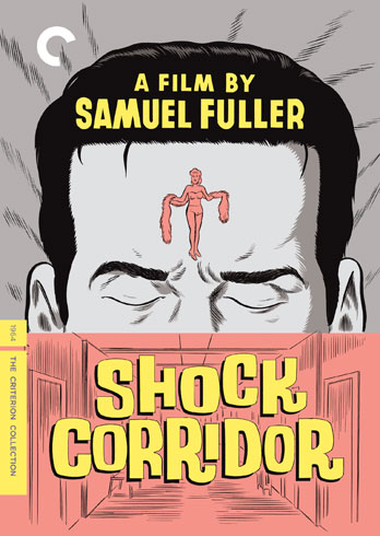
5. Shock Corridor & The Naked Kiss
Credits – Art Directors: Sarah Habibi, Eric Skillman / Illustrations: Daniel Clowes
These two early spine numbers desperately needed to be restored and redesigned. Out of nowhere Criterion commissioned Daniel Clowes to illustrate both these titles. Bringing new life and vitality to two of Fuller’s greatest films, and it’s clear that Clowes is a Fuller fan.
The decision to include Clowes on this project also sent Criterion rumor mills churning over the idea that Terry Zwigoff’s Ghost World will eventually be released in the collection. Let’s hope it does.
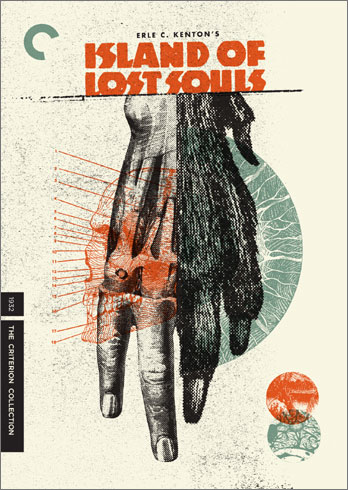
4. Island of Lost Souls
Credits – Art Directors: Sarah Habibi, Eric Skillman / Design: Aesthetic Apparatus
Aesthetic Apparatus is responsible for some of the most stunning covers in the collection. Eyes Without a Face, If’¦, and more recently Island of Lost Souls. Featuring beautifully layered images of sinister medical blueprints, manimal monstrosities, and terrifying typography, one can easily see why Criterion keeps coming back to Aesthetic Apparatus.
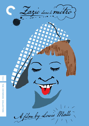
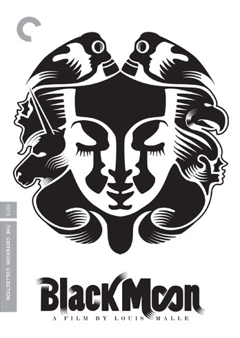
3. Zazie dans le metro & Black Moon
Credits – Art Directors: Sarah Habibi / Illustrations: Yann Legendre
It might not seem strange that I would lump these two titles together, but may surprise some of you that the same designer is responsible for both covers. Yann Legendre has been designing gorgeous illustrations for The New Yorker, The New York Times, and countless other publications around the world.
His fantastically oneiric illustration and type for Black Moon is most indicative of Legendre’s work and most fitting for Malle’s futuristic fairy-tale. Zazie dans le metro is all together different, but still a perfect match for Malle’s child-centric film. Just like Malle’s oeuvre, Legendre never does the same thing twice. It really is the perfect marriage, and one that I hope continues in the future.
2. The Killing
Credits – Art Directors: Sarah Habibi, Eric Skillman / Designer: Connor Willumsen
At last year’s All Tomorrow’s Parties, Criterion commissioned several graphic artists to advertise their line-up of films. Conner Willumsen’s hand-drawn interpretation of The Killing really stood out among the rest (although all of them were equally amazing). Thankfully, Willumsen’s design was used for mainline release.
Seemingly quick and dirty, but elegant and expressive, I’ve never seen such a beautiful cover made solely with pencil and sharpie. I hope that Criterion will eventually make prints of their online store’¦.and will ship them internationally.
1. The Sweet Smell of Success
Credits – Art Directors: Sarah Habibi, Eric Skillman / Illustrations: Sean Phillips
One of the first titles of 2011 could easily be the best cover of the year. Sean Phillips’ original painting for Sweet Smell of Success perfectly depicts the film’s noir visual style, while evoking the lurid colors of the New York City streets. The hand drawn, Beat Generation style block typography really brings everything together.
Perfect pulp novel sensibilities and 1950s style illustrations, and still distinctly evident of Sean Phillips’ style. He was even able to use the restrictions handed down from the licensor to reveal more about the character relationships in the film without seeming blatant or ham-fisted.





Robert, thanks for this rundown of your favorite covers. I like the style and creativity that goes into Criterion’s packaging as well, but your trained eye and insights really shed some helpful light on just what it is that I enjoy about their design work!Â
Thanks, David. Â I will be contributing more often to CriterionCast next year. Â I have a few For Criterion Consideration submissions that will hopefully encourage Criterion to pick them up….and give me a job.