I know, I know, this has to be one of the silliest posts I’ve done, right? Well, you might think so at first, as slight amendments to a proposed cover aren’t big news in any film circles, but I thought this could springboard into a larger discussion of the Criterion Collection, and their overall design aesthetic, and perfectionist behavior.

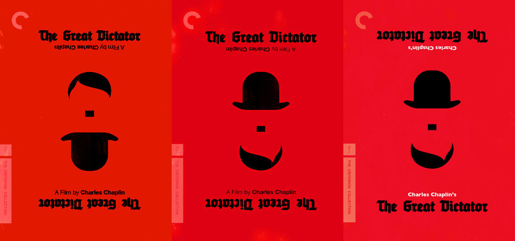
Last year, the incredible graphic design artist, Olly Moss designed a series of minimalist posters, including the design which was picked up for the cover art for the Criterion Collection’s release of Charlie Chaplin’s The Great Dictator. It’s a simple red background, with black imagery. This recent trend of minimalist posters has certainly divided many online, between those that might have once found them clever, but now find them cliche and over exposed, and those that can’t get enough of them. While I certainly can appreciate that anything overexposed will eventually become obnoxious, I have not lost my interest in appreciating art like this. The idea that you can whittle down a film into three simple graphic pieces, the dictators hair, and the iconic Chaplin hat, with an equally iconic mustache holding the two together, no matter which way you look at it, is fascinating from a story telling perspective. Even if you have no idea what the film is about, this cover does so much more than if they were to simply employ an image from the film. I’m still torn on whether I like the font choice of the title. It is clearly expressionistic and evocative of an era and style, but it just doesn’t grab me.
When Criterion put out the initial cover art, I didn’t put too much thought into the fact that it was the dictator on top, with Chaplin’s character below. Does this design choice imply a power of the dictator over Chaplin? In comparing the first image to the later ones, I’ve found the first could almost be seen as the dictator holding the hat out, as a sign of victory. That might be reading too much into it, but it could also be a reason for flipping the image vertically. With the second version that Criterion put online, the wording and placement of the text is identical, but now Chaplin’s character is on top, with the dictator below. This, I think, helps the viewer read the film differently, and would avoid any confusion about the film’s message.
The third, and most recent version of the Great Dictator cover is also interesting for several reasons. The placement of the central characters remain the same as the second image, but now we have the introduction of a whole new color in the palette, and a new design choice for the text. The first two images had the title right side up on the top of the image, with the directing credit flipped. On the bottom of both images, we had the credits right side up, with the title upside down. With both of those, you could theoretically flip the image, and read it the same way. You’d read the title on top, and the credits below. With this third design, the credits and title match, and you’re only reading the bottom of the cover. The top text is upside down, and would only be read if you flipped the image around. They’ve also decided to take out the “A Film by” when crediting Chaplin. I almost think this is Criterion assuming that the people looking at this cover, you’ll know it’s a film that you’re looking at. Or maybe even that the fact that it’s a film is irrelevant. It’s his work. His piece of art. They’ve also made his name stand out by adding white to the image, in his name. It could be that they’re making his name stand out above everything.
While I think we all assume that Criterion has a master plan long before they ever release anything to the public, we all have to remember that they’re a group of people that love film, and want to see it portrayed and archived in the best possible manner. This means pulling designs when they don’t work. Questioning their own decisions, and showing that they’re human. I love it. All of the above thoughts are completely speculative. I don’t have any knowledge as to why they’ve made these changes, but I love that changes were made. I’m a fan of constantly revising your thoughts on life, art, and philosophy, and never allowing yourself to become so rigid that you can’t change your mind.
I can’t wait to see the final printed version of this. The Modern Times release that Sam’s Myth helped produce is a gorgeous piece of art all around, from the cover to the interior booklet. I hope that Criterion gets Olly Moss to design the booklet as well, and perhaps the menus of the discs.
What do you think of these design choices? Am I totally off my rocker and is this post a complete waste of time? Leave your thoughts below.
Pre-order the DVD or Blu-ray from Amazon.com


Nice post, I love seeing analysis on decisions like this. This cover… I have to say, I just really don’t like it. I LOVE the cover for Topsy-Turvy (or coverS, as the DVD and Blu-ray are inverted) but this one just doesn’t sit well with me. I think the reason is that, for Topsy-Turvy, the image works either way. It works BOTH ways. You wouldn’t really catch on immediately that it could be flipped, were it not for the title being across the top and then the bottom, the opposite direction. This cover, however, either way you look at it, part of the image is upside-down and there’s something about that that doesn’t work for me. Maybe that’s why the Criterion team keeps tweaking the image as well, I don’t know. As the film is called “The Great Dictator” I feel like the dictator’s hair should be the one that’s right-side up… but then the hat being up-side down still bothers me and vice-versa with it inverted.
I’m so glad you mentioned the font they used which was the first thing that really stood out to me as not quite fitting, and to be honest, I’m not digging background color either. I guess this seems kind of nit-picky, but there really isn’t a thing about this cover that strikes me as just working. What’s odd is that I actually liked the original poster several months back when I first saw it. I’m not sure which change from the poster to the cover was the deal-breaker for me. Maybe if they tweak it again they’ll change something and I’ll finally go ‘Ahhh, that’s it!’
I like the three color palette, and lessening the transparency on the white label sharpens everything nicely. I’m sure Jack White is creaming over it right now. I think it goes without saying that Olly Moss will be designing the booklet and menus.
Does he blog? I enjoyed Sam Myth’s posting of variations and rejects.
Oh, how I wish I could freelance for the CC…
I found the article very interesting.To be honest I never put that much thought into the packaging of “The Great Dictator”.I just thought it was rather clever the way the Barber and Hitler were portrayed very minimalistically…is that even a word?Anyway,terrific article on one of my many favorite Chaplin films.
According to a tweet by Olly Moss, Rob Jones is doing the menu design for this title. Jones has done a number of posters and package designs for The White Stripes and Jack White’s other bands.
Some people care about the design aesthetic of Criterion titles more than others. I tend to find it one of the premiums associated with Criterion. It doesn’t make or break whether I buy a title, but I’m always excited to see the new covers. The danger of setting the bar high, of course, is that they continually are held to a certain standard.
I was never a fan of The Great Dictator design. First, it seemed derivative on the heels of the Topsy-Turvy cover. Didn’t anyone in the art department notice they had two titles coming up employing a very similar visual trick? Granted, the Chaplin image is more clever, but it also followed the Topsy-Turvy release.
Specifically to the The Great Dictator design, I disliked the intense red and the gothic black font. Sparse black on vivid red is very striking, but serves more as an alarm than an attractor. It’s physically hard on the eyes.
With this second revision, I like the introduction of white to soften the intensity a bit, and I think flipping the text has helped as well.
As far as the image, the top hat works best on top. It identifies the title at-a-glance as Chaplin, and the “Hitler hair” appears a superfluous kerchief or collar. When flipped, it’s Hitler with an upside down top hat. It just works better they way that they have it now.
So, for not liking the original design, I’m actually pretty pleased with the tweaks they’ve made without hanging Moss’ original design completely out to dry after the initial mixed fanbase response.
Sorry for the long comment.
it all makes sense now…
an illustration conspiracy!
You are not alone in finding these changes interesting. One further point is that in adding white the design now completes the pallette of the Nazi flag. Ol’ Adolf was a painter and something of a graphic designer. Black red and white constitute a very powerful colour combination. Just ask the White Stripes.
I thought I was the first to comment. Didn’t realise that the White Stripes had already been mentiooned.