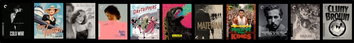
 The Criterion Collection just sent out their official press release for the September titles that we wrote about a couple day’s ago, with a piece of the puzzle that was notably missing on Tuesday.
On Monday evening, when everyone was speculating about what titles would be announced on Tuesday, for Criterion’s September releases, a few people spotted Terrence Malick‘s The Thin Red Line in the “Coming Soon” section of the Blu-ray area on the website, but with a black “box art coming soon” logo in place of the finished work.
We just got the artwork below, and it looks fantastic. If I’m not mistaken, this is the handiwork of the incredible Neil Kellerhouse, who has consistently been producing some of the best Criterion Covers, from Paris Texas, to the new Seven Samurai set, to the recent re-release of Walkabout. You all should check out his website, which offers a beautiful gallery of his work.

What do you think of this art for The Thin Red Line? Talk about it in the comments below.
[Edit from Ryan, 7:00pm 6/17/10:
I’m including the following images, to show that the other titles have that blue strip along the top of the covers, in the press release. Again, this is most likely just a mock up effect, and will most likely not be included in the final product, because of how they were presented on Criterion.com, when they were announced. The final product will most likely continue their traditional blu-ray sticker on the outer plastic. ]


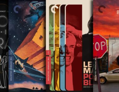


The graphic looks fine, though going by the website, I think he's done better. I'll suspend judgment until I see the final package. But more significantly, where's the C? Are they really going to put that big Bluray logo across the top? I suppose this film qualifies as a potential mass-market release a la Benjamin Button's traditional blue-plastic case… but I hope Criterion doesn't allow such an anomaly to go all the way through to final release!
yeah, the image is decent, but i find it hard to believe they would leave all signs of criterion-ness off the cover, as well as the awful bluray logo. the BB slipcase doesn't even have that on it.
DOES NOT LIKE. I appreciate the concept, but the execution is all wrong. Where the heck is the Criterion Spine and C???? NO THANKS. On a recent tweet, Criterion said they were “trying something new” with regards to the newsletter. I think it is going to have something to do with the artwork for The Thin Red Line, maybe they will let newsletter subscribers vote on final artwork?
Very appropriate for the empty feeling in the movie cool artwork love It totally!
I don't think the blue line across the top will necessarily be on the final product, it may just be a mock-up item.
I think this is a custom cover. Even Benjamin Button's case, which used the blue Blu-ray case, still had the Criterion spine and logo on it. This looks like someone's custom artwork on a forum, it just lacks the polish of a Criteiron cover. Was this image sent to you guys by Criterion themselves? If not, I wouldn't trust it.
Trust this man here: Ryan Gallagher, he can do no wrong, It's Official artwork and it's great.
The art was sent from Criterion, there was no note on it indicating that this art was not the final product artwork. Something to note about the Blu-ray logo along the top, all of the artwork contained in the press release had that strip, despite them not being on the artwork that was put up on Criterion.com
Well if it was sent from Criterion then I suppose that means it's pretty solid. I think I will just wait and see what Criterion puts on their website. I love the imagery in the cover, but an ugly blu-ray logo just makes me want to stab myself in the eye, despite the beauty of the actual image. Hoping and praying that ugly blu-ray strip on the top never makes it into the final cover art. I will say that if it is indeed Kellerhouse, I think while he did a great job here, he's done better. Walkabout's re-release should be the standard IMO.